1. Identify data you want to share to your followers
Use data that tell an important story and lend themselves to visual representation. Experts suggest that if too much text is required to explain the data, it isn’t well suited for infographics.
For the purposes of this blog post, I’m using the Pew Research Center data on online video usage from our assigned class readings (http://www.pewinternet.org/files/old-media/Files/Reports/2013/PIP_Online%20Video%202013.pdf).
2. Set up a free account on piktochart.com
Piktochart is a cool and easy resource for creating great-looking infographics. Just set up an account at www.piktochart.com

As a caveat, this was my first time using Piktochart. I found it remarkably intuitive and stylish. I’ve never made an infographic before, but in 30 minutes a came up with a pretty decent looking result. I’m sure with more time and practice the options are limitless.
I also want to note that I used Jing (another tool mentioned in this week’s materials) to capture all the screenshots in this blog post. It’s a really handy tool.
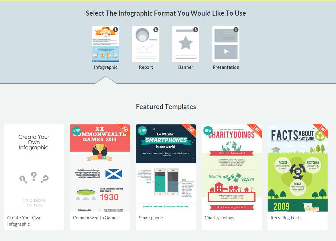
3. Select a a format and free template (or go pro)
There are 4 categories of chart formats: Infographic, Report, Banner, and Presentation.
I stuck with Infographic.
I found dozens of free templates on the site for creating a variety of types of infographics. You can also pay to become a “pro” member to obtain additional templates, features, privacy controls, stock images, and remove the Piktochart watermark from your infographics.
4. Use their tools to customize your infographic
The controls are fairly intuitive after you play around for awhile. Here’s a breakdown of the tools on the left control pane in the editing window:
- Graphics – Piktochart has a huge library of free graphics that you can insert and edit. They even have some logos available like Facebook and YouTube. Simply search a keyword like “hammer” or “arrow” or “YouTube” then sift through the results and drag and drop a graphic into your template. Piece of cake.
- Uploads – allows you to upload images from your desktop.
- Background – allows you to change the opacity/gradient/texture of your background.
- Text – you can insert a variety of text boxes that are themed to your template (functions similarly to PowerPoint). The app has a lot of cool built-in fonts beyond your boring old standbys like Arial and Verdana.
- Styles – you can change the color scheme here. I liked the preset scheme for the template I chose, so I left this alone.
- Tools – makes it easy to insert charts, maps, videos, and dividing lines into your graphic. You can manually type data into an Excel-like field and play with chart types. You can also import data directly from a Google Spreadsheet. Pretty cool!
- General interface – The template itself feels and functions a lot like a PowerPoint slide with everything in boxes. When dragging around images and text, “snap-to” gridlines appear to make it easy to line things up. The toolbar at the top contains typical font controls, undo, copy/paste, and alignment tools.

Piktochart editing interface
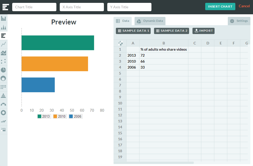
Data entry field
5. Share to your followers!
Once you’ve finished your infographic it’s easy to download it, publish it, or share it directly from the Piktochart interface.
Here is my finished chart:

Online Video Usage Among US Adults – An infographic by Zach Capshaw

I’m a big Piktochart fan!
Awesome share! I haven’t used this particular tool, but am strongly considering it for some of my projects. I love tools that help that help the average public health manager or practitioner use data in interesting and useful ways. You could still walk into any sort of public health department or NGO and find numerous excel spreadsheets and access databases that could take advantage of using better data viz tools like this. Hopefully, they all read this post. 🙂
Love this Zach! Thanks for the tutorial – I am definitely planning to use this!
Great post Zach! I will definitely be using this tool for future work!